Overview
Responsive Layout divides a page into 12 equal columns, supporting flexible page design across a range of screen sizes. Components can span multiple columns and rows, allowing content to adjust as the available screen width changes.
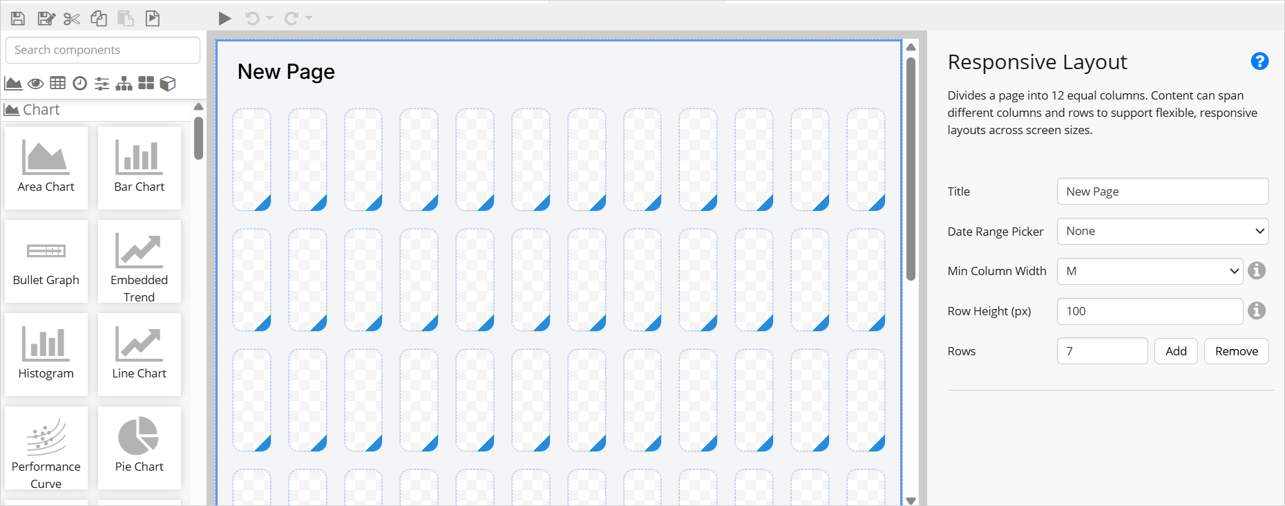
A page created with the Responsive Layout contains a preconfigured Responsive Grid, defined by default as a 12x7 grid of 1x1 cells. Newly added rows also contain 1x1 cells.
The Responsive Grid arranges components in a left-to-right, top-to-bottom flow. You can drag or paste components into the layout, and they are placed within this flow. Components can be repositioned, but their placement follows the layout flow rather than fixed cell positioning.
When the screen width is reduced and there is not enough space for all columns, the column count is reduced, and components are rearranged automatically to fit the available space.
Responsive Layout Properties
Responsive layout properties control the page layout, grid structure, and title and date range picker settings.
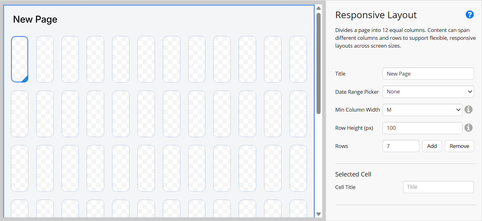
| Title: | The text displayed in the page title bar. |
| Date Range Picker: |
Determines whether a date range picker is shown in the title bar. By default, this is set to None, which hides the picker. Select Fixed Reporting Period or Timeseries to display a date range picker.
|
| Min Column Width: | Defines the minimum width allowed for a column. When this width cannot be maintained due to reduced screen width, columns are rearranged onto a new row. Select from the fixed options: XS, S, M, L, or XL. |
| Row Height (px): | Defines the height for all rows in the layout, in pixels. |
| Rows: | Specifies the number of rows in the layout. Use the Add and Remove options to adjust the row count. Newly added rows contain 1x1 cells by default. |
| Selected Cell - Cell Title: | The label for the selected cell. This can be used to provide a title for the content within that cell. |
Date Range Picker
The date range picker can be used to display a date selection control on the page. You can select an option from the Date Range Picker dropdown.
None: The default selection. Hides the date range picker from the page.
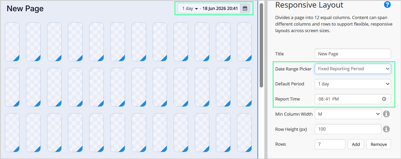
Fixed Reporting Period: Displays a date range control based on predefined reporting periods. You can select the Default Period and Report Time to configure how the reporting period is applied.
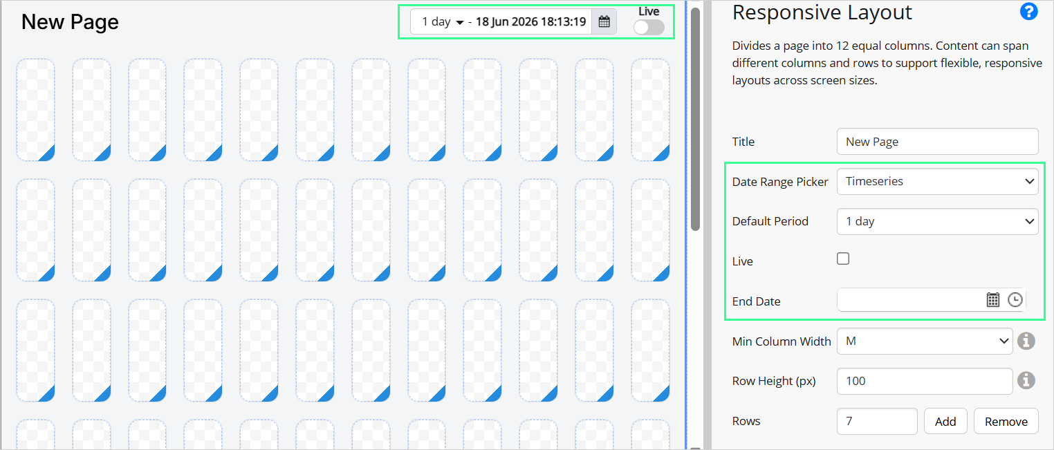
Timeseries: Displays a date range picker with time-based selection. You can select a Default Period, enable Live to automatically update the time range, or select an End Date.
Min Column Width
The Minimum Column Width setting controls how the layout adapts to different screen sizes.
The layout uses a 12-column grid. When there is not enough horizontal space, columns do not shrink below the selected width. Instead, the number of columns is reduced, and components move onto new rows.
The available options represent typical screen sizes:
- XS - Phone (portrait)
- S - Tablet (portrait)
- M - Phone or tablet (landscape), laptop
- L - Desktop
- XL - Ultra-wide monitors
As the screen width decreases, the layout adjusts by reducing the number of columns and rearranging components to fit the available space.
Things To Know
Here are some useful things to know about Responsive Layout:
-
Responsive Layout can only be used at the root page level. It cannot be added from the component toolbox and cannot be nested inside another layout.
-
Design mode and Preview mode behave differently. The responsive behaviour is visible in Preview or runtime. In Design mode, the grid remains fixed for editing.
-
Empty cells can affect preview behaviour. Blank areas may result in slight differences in the layout, as empty cells are not part of the rendered layout. Populate intended areas for consistent results.
Tutorial: Creating a Responsive Layout Page
If you are unfamiliar with the process of building pages, read the article Building an Explorer Page.
This tutorial shows how to create a page using Responsive Layout.
Step 1. Create a new page
To start, click New Page on the Home tab of the Explorer ribbon.

Select Responsive Layout.
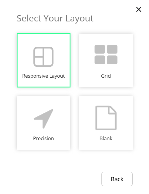
A new page is created with a preconfigured Responsive Grid.
Note: Responsive Layout is available only as a page layout option when creating a new page. It is not available from the component toolbox and cannot be nested inside another layout.
Step 2. Review the default layout
The default Responsive page is created as a 12x7 grid of 1x1 cells.
New rows added later will also contain 1x1 cells.
Step 3. Edit the title bar
In the page header, edit the title text as required.
Step 4. Configure the Date Time Range Picker
By default, the Date Time Range Picker is set to None, which hides it from the title area.
Select Fixed Reporting Period or Timeseries to display a date range picker in the header.
Step 5. Set the Minimum Column Width
Choose the Minimum Column Width for the layout.
Select one of the available options: XS, S, M, L, or XL.
This setting controls when the layout adjusts by moving components onto new rows as the available screen width decreases.
Step 6. Add components to the page
Drag or paste components into the Responsive Grid.
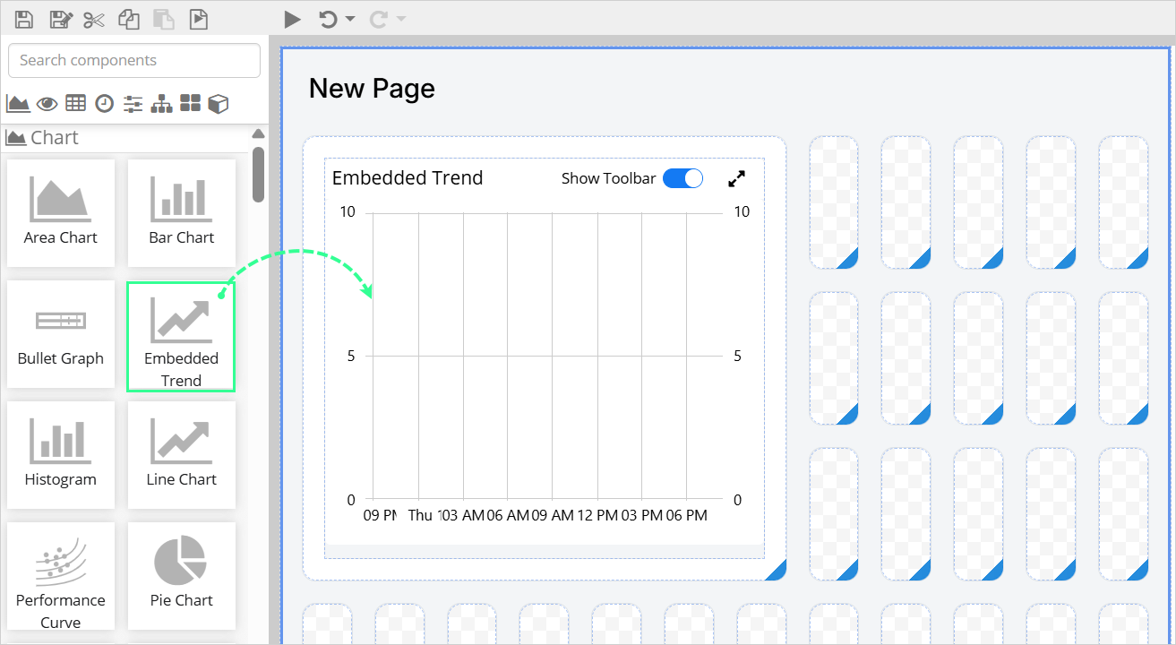
Components are arranged in a left-to-right, top-to-bottom flow and are positioned within this flow based on where they are placed.
Step 7. Reposition components if required
Components can be repositioned within the layout by dragging them to a different location.
Their final placement is determined by the responsive layout flow rather than fixed cell positioning.
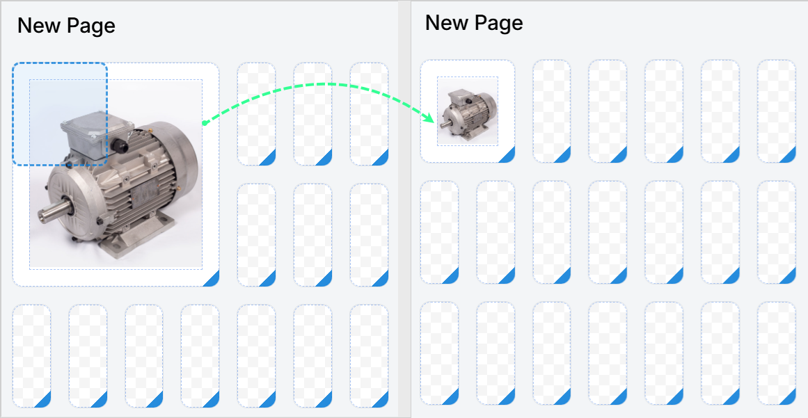
Cells can also be merged and resized to allow components to span multiple rows and columns.
Step 8. Preview the page
Switch to Preview mode to check how the layout behaves at different screen widths.
When the screen width is reduced, the column count is reduced and components are rearranged automatically.
If the page contains empty areas, it may result in slight differences in the preview, as blank cells are not part of the rendered layout.
Step 9. Save the page
When the layout is complete, save the page.
Now you have a page created using a Responsive Layout that adapts to different screen sizes.
Merging and Resizing Cells
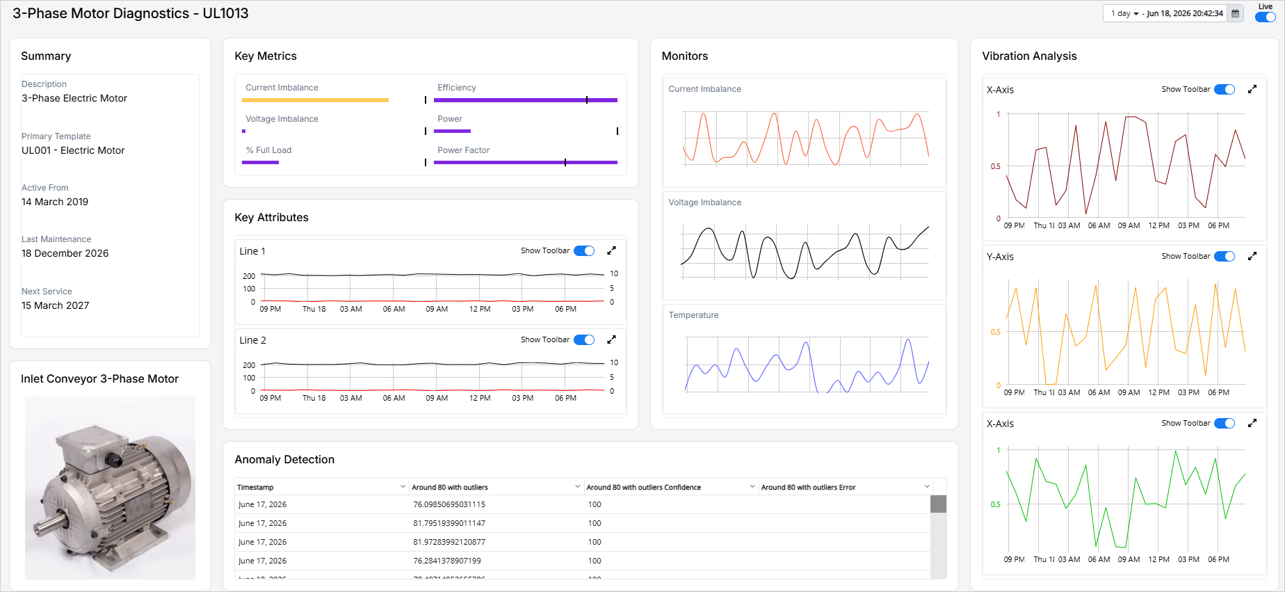
Responsive Layout allows cells to be merged and resized to create layouts that best suit the content displayed on the page.
Merge Cells
To merge cells:
1. Select a cell in the layout.
2. Drag the resize handle in the lower-right corner of the cell.
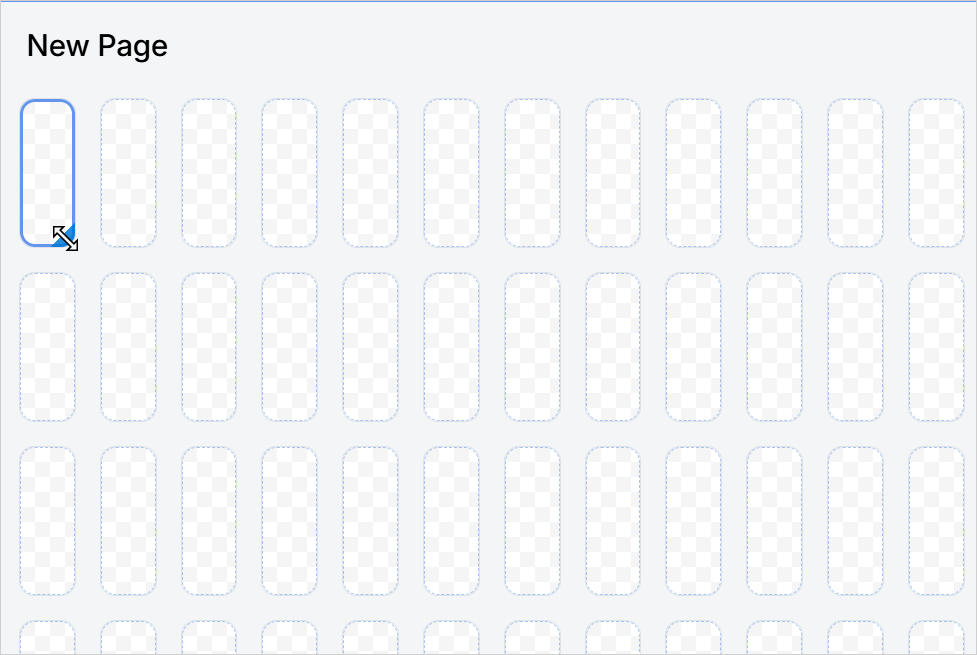
3. Extend the selection across the adjacent cells you want to include.
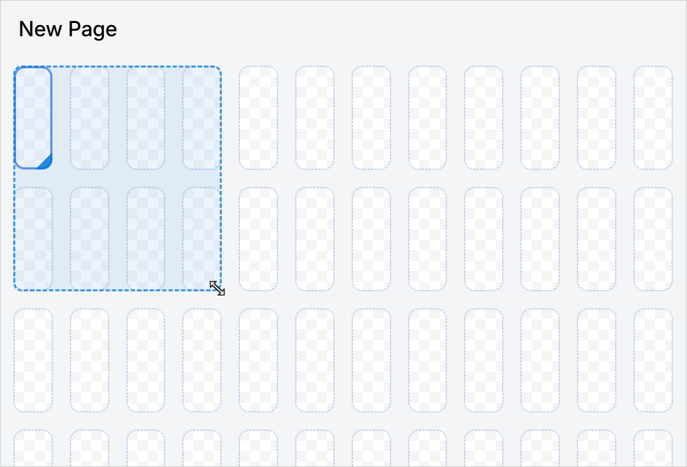
Cells can be merged:
- Horizontally to span multiple columns.
- Vertically to span multiple rows.
- Across both rows and columns to create larger grid areas.
Merged cells can also be included in a larger merge operation when the entire merged area is selected.
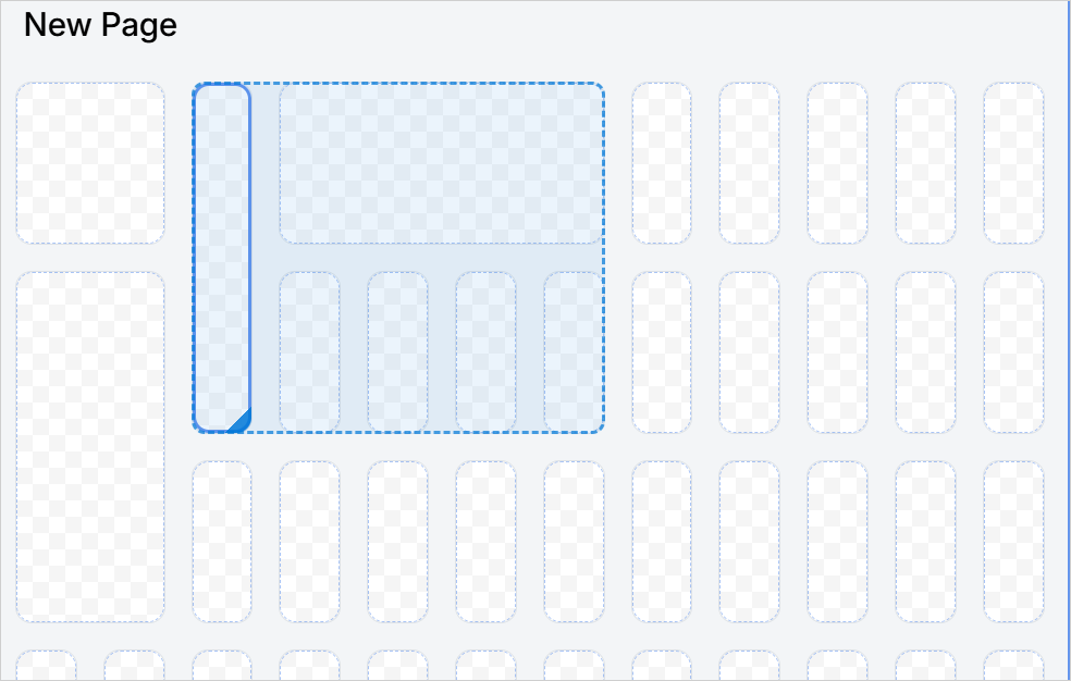
A merged cell cannot be included partially in a merge operation. The entire merged cell must be selected, and the merge operation cannot begin or end within an existing merged area.
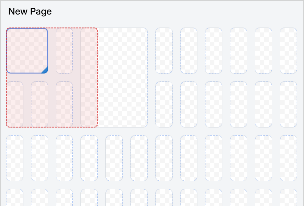
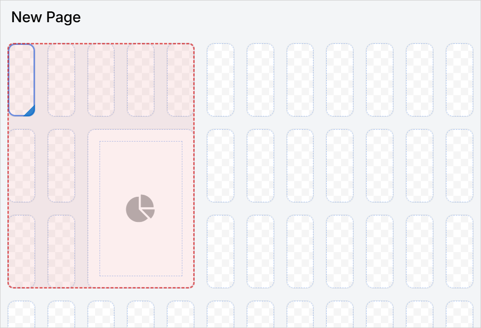
A merge operation cannot be performed when any cell in the selected area contains a component, even if the remaining selected cells are empty. Move or remove the component before attempting to merge the selected area.
Resize Cells
Cells can be resized after they have been merged.
To resize a cell:
1. Select the cell.
2. Drag the resize handle in the lower-right corner of the cell.
3. Increase or reduce the cell size as required.
Cells containing components can be resized without affecting the components they contain. The component adjusts to fit the new cell size.
Release History
- Responsive Layout 26R1 (Cloud Release)